Turning Petrus into a warmer, more modern brand system across every touchpoint.
Client
Petrus
The Challenge
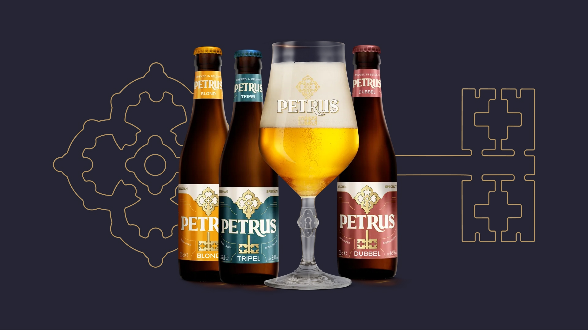
Petrus needed a stronger, more consistent visual world that feels premium, but less distant and intimidating. The goal was to modernise the identity, keep recognisability, and make the brand easier to express consistently across packaging, campaign, and retail.
The Idea
Make Petrus feel like a wise friend, not a distant teacher — quality, warmth, and meaning without the lecture
The Solution
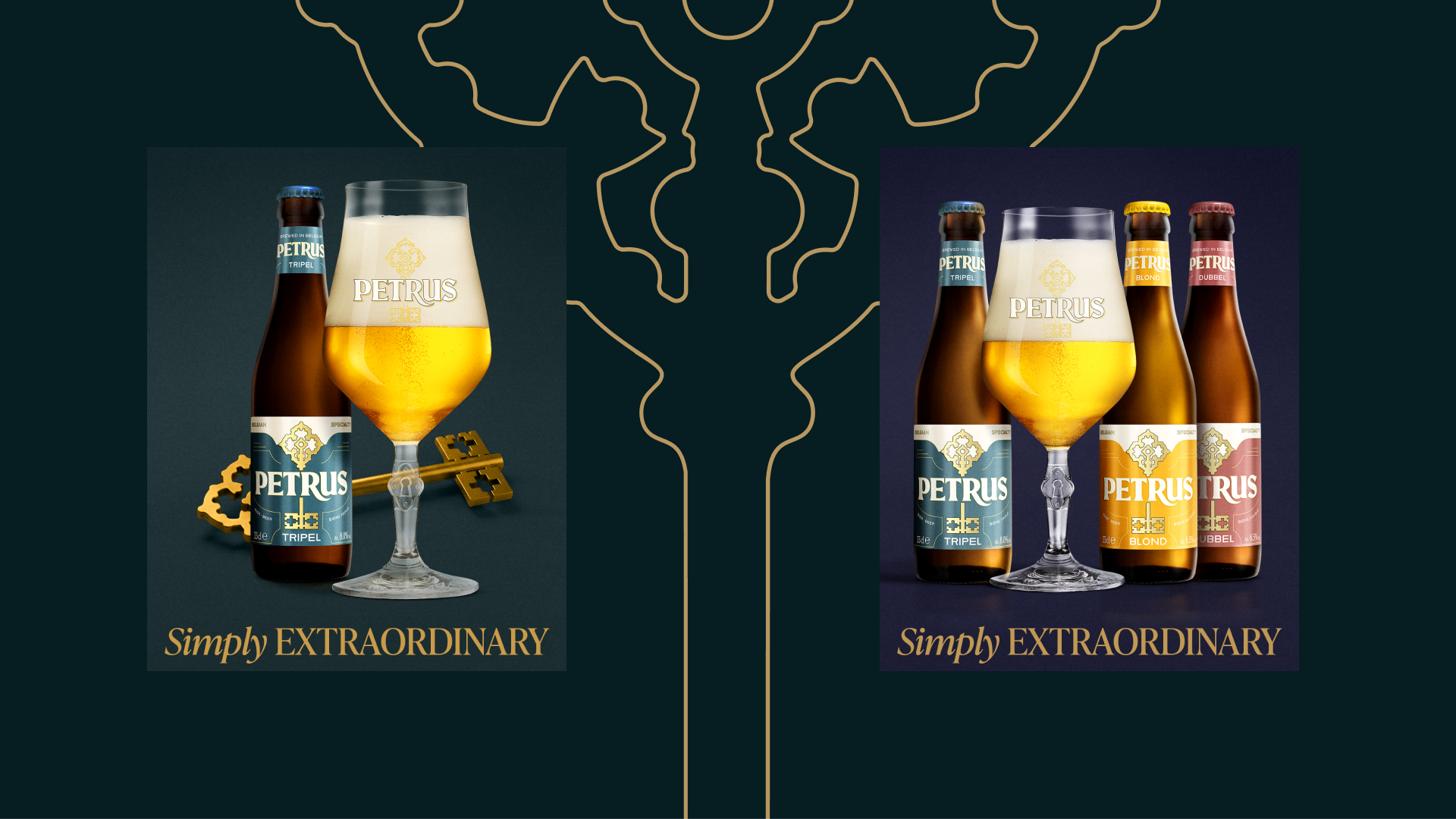
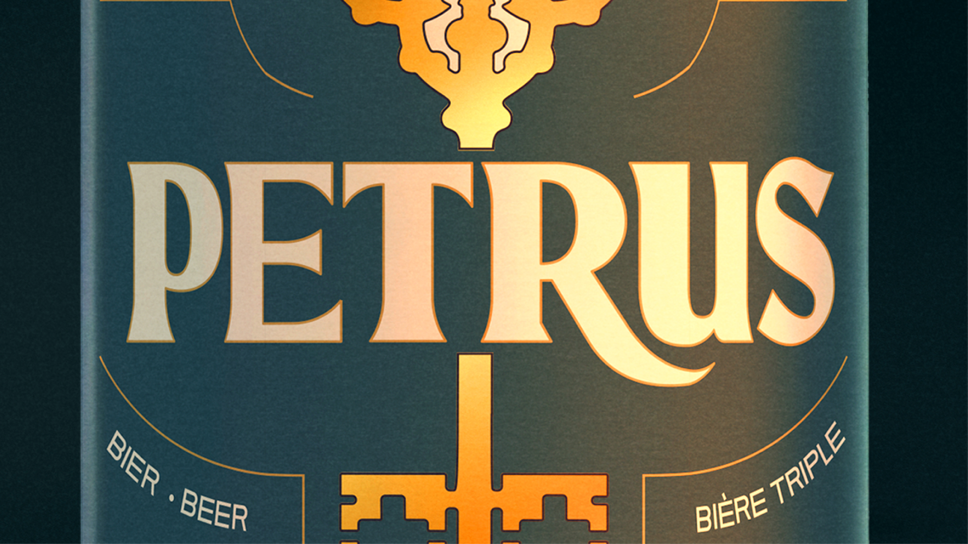
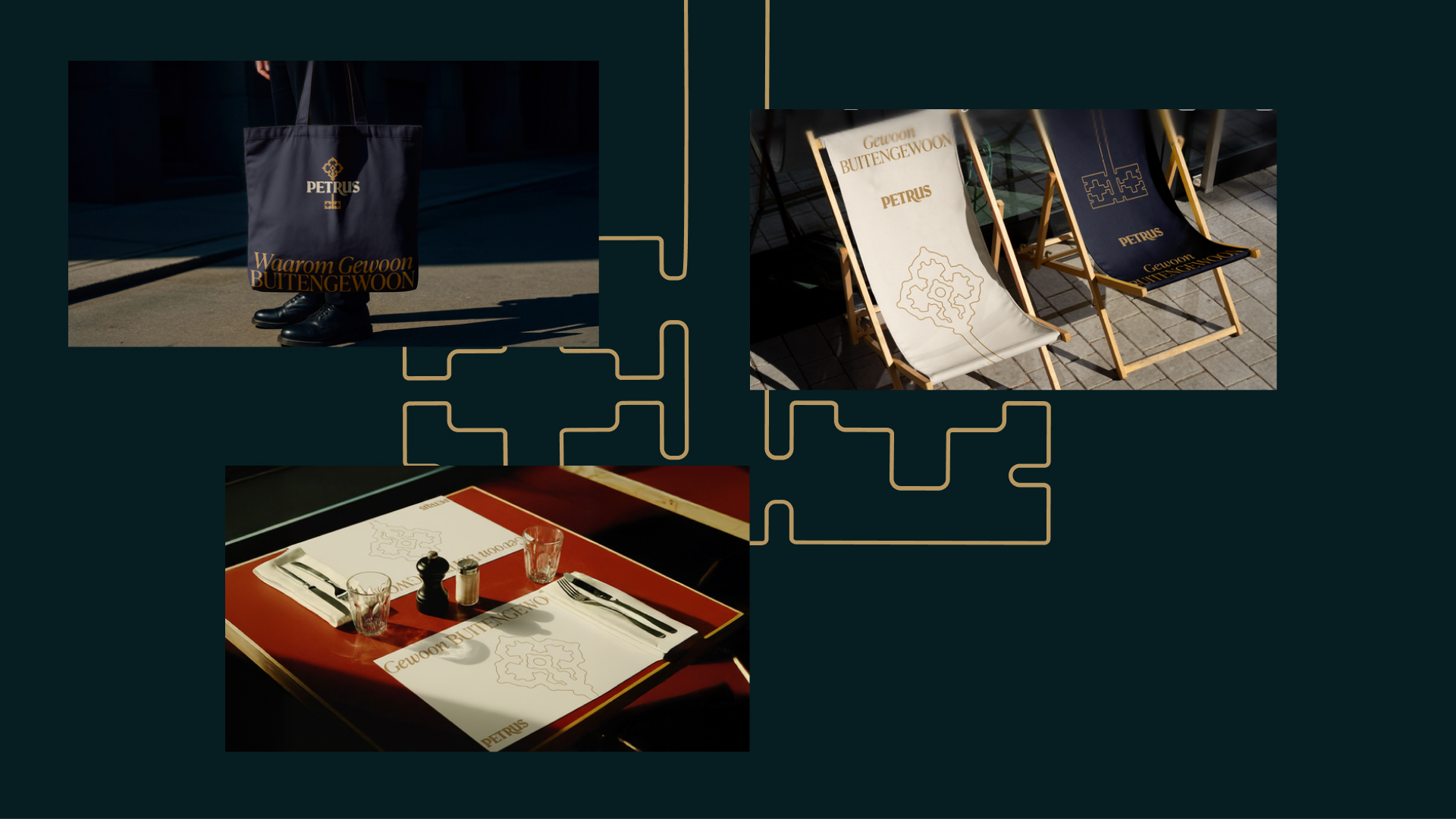
- Refined the identity without losing recognition: we polished the logo and updated the visual system, kept the key as a strong brand asset, and created a clearer set of brand elements (colour, type, icons, tone of voice).
- Put the key at the centre of the brand world: stronger focus on the key symbol, with less reliance on heavy religious cues — broader appeal, same character.
- Built a complete brand system: colour palettes, typography, icon style and tone-of-voice rules — so the brand looks and sounds consistent everywhere.