Refreshing an iconic cycling beer without losing its roots.
Client
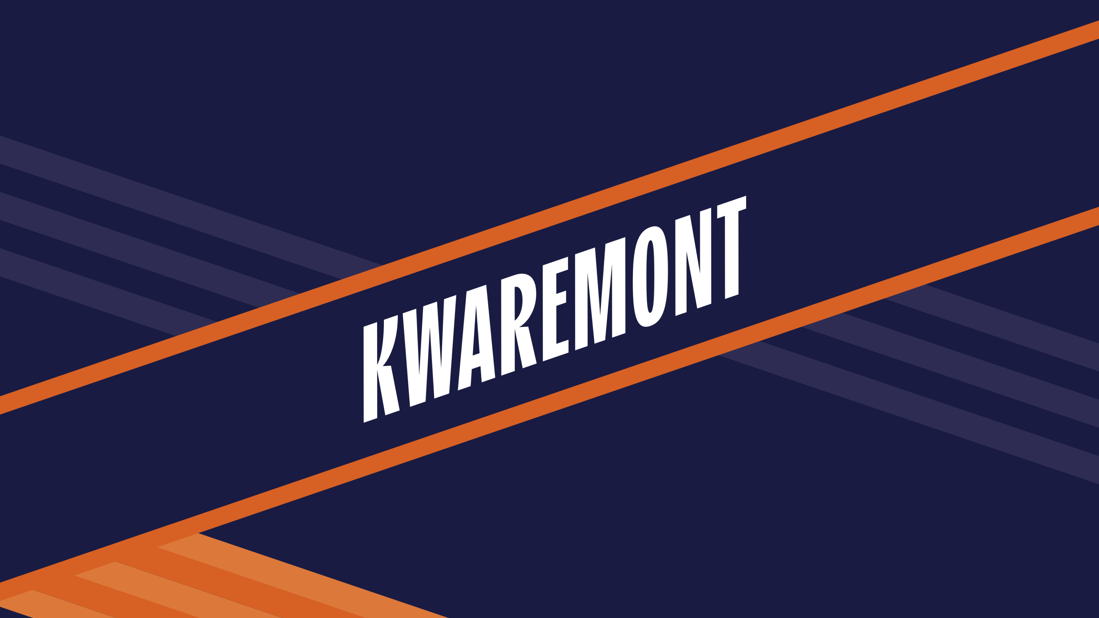
Kwaremont

The Challenge
Kwaremont needed to sharpen and elevate its position as the beer for cyclists with a more consistent, modern brand world that could live across packaging, campaigns, partnerships and point of sale. The job was to keep the brand instantly recognisable and rooted in cycling culture, while making it more premium, more energetic, and relevant for both active and passive riders.
The Idea
Create a long-term platform that makes Kwaremont the natural reward in cycling culture on the bike, around the race, and after the ride.
The Solution
- Modernised the brand without rewriting its DNA: we kept the cycling heritage front and centre, but refreshed the look and feel to be more vibrant, energetic and inviting.
- Created one clear approach across the full range: a consistent logo and branding system that strengthens shelf impact and makes Kwaremont instantly recognisable.
- Expanded the audience in a natural way: from “serious cyclists only” to the wider cycling community—riders, fans, friends and supporters—without losing credibility.
- Introduced a simple campaign line that travels easily: “That deserves a Kwaremont” turns the brand into a clear ritual celebrating effort, passion and shared moments around cycling.